It’s been awhile…Since the last time I blogged, the DC, ET, and Computer Science juniors went to Charleston. That was an awesome time! We got to tour the College of Charleston and the Art Institute. After the tours, we were allowed to go walk around downtown Charleston and look at the markets, go to the park, and shop at the many stores. For lunch, a big group of the DC kids went to a pizza place called Pizza de Giovanni’s (i think). We got a 28 inch pizza with it split into quarters so everyone could get the toppings they wanted. We actually had to draw a picture of the pizza we wanted for the cook because of how difficult we were. We were all so hungry after walking around Charleston that only two pieces were left once we were done. Overall, the trip was super fun! For about 2 weeks, we have all been working on our personal websites, where we get to showcase our work online. So far, I have a really basic home page with my links, an about me paragraph, my contact information, and my “achievements” for this year. My portfolio page has about six edited photography pieces and five graphic design pieces (which includes my holiday cards, my hot sauce label, and my candy bar wrapper). I also added a watermark to my important pieces so that my images are protected. I really want to learn how to do a drop down menu so when someone hovers over my portfolio link, they can go to my photography portfolio or my graphic design portfolio. One thing I want to do I take more photos and graphic design pieces to put on my website so that for my senior mastery I can show as much work as possible. Right now, I am not really impressed or “wowed” by my portfolio. So that’s why I want to make even more pieces. I am aspiring to make my website as good as Henry’s and all the other seniors’. They have some awesome websites. So yeah, I’ll write again next week. Bye.
April 13, 2018
I’m finally done with the first four chapters of Dreamweaver! I am hoping that what I learned in these chapters will help me create an awesome webpage. It is one of the most tedious and annoying programs we’ve worked with. I’ve learned a lot more about the CSS and styling parts of web design as compared to the HTML coding that we learned with Code Academy. In Dreamweaver, we learned about the different sections of a web page, like the header, footer, and content. We used selectors in Dreamweaver way more than in Code Academy. Selectors are going to be super important whenever we make our websites because they allow you to make different adjustments to only certain parts of you site, which is super helpful. Hopefully, making our website is going to be more interesting and fun though. My spring break was not very eventful. I didn’t get to go anywhere out of town like I normally do. I had to somewhat work on two projects for Spanish and US History and do edpuzzles for US History during spring break, which was not fun at all. However, I did get to go to Huntington Beach the weekend before we came back. I got a really bad farmer’s tan though. I also got to have dinner with one my mom’s friends that we hadn’t seen in awhile, which was nice. So nothing too crazy went down over the break. I really just appreciated being able to relax and not having to wake up at 4:30 in the morning. I really need to start thinking more about my website. So far, I know that I want the main colors of the website to be black, white, and gray, since that are the colors of my logo. For my portfolio, I know three main images I want to put in my portfolio. I also want to start making more digital art so I can show that I can create more than just photography pieces. I also want to see if I can finish my kinetic typography and improve on the part I have already done. I really hope I can make a pretty good website.
March 16, 2018
Hey blog readers…Dreamweaver has been really confusing. I really should not have missed school last Friday because I feel like I missed a couple of important things that would help me better understand all of the things that are being talked about in the videos. But I’ll catch up eventually and hopefully will be able to create a nice looking website for myself. For my website, I plan on putting all of my photography that I’m actually proud of and some of my graphic design pieces, like my candy bar and hot sauce label, so that people see I can do more than photography (kinda). I am soooo nervous about the Burroughs and Chapin competition. I am happy about my entry considering I only had a couple of days to take the photo and create the piece. I am really worried that I won’t get in the show but I really want to be able to say that I got into all of the shows I entered this year. But, I was confident in my picture for Art Fields and it got in, so I just have to be confident in this piece and hopefully that means it will get in to Burroughs and Chapin. So far this is all I have for my Earth Day at the Day poster. My life has been really busy here lately with my academic classes, B&C, and all of the other things going on in my life that I have not worked too much on this poster. But considering that, I am somewhat happy with how this turned out. I am not sure why it is sideways because in Illustrator it is positioned correctly, so I’ll have to fix that (File would not work on my blog or else I would have put it in the post). This quarter has been so hectic and crazy, that I’m surprised I’m doing so well in all of my classes. Chemistry is one of the most boring classes ever, so it is really hard to pay attention. But I have a high A in there right now. Spanish with Rosina *insert eye roll* has been going well too. It is a lot of work but I have gotten it all done on time. US History is actually going way better than I thought it would whenever the class first started. I have gotten no lower than a B on any of the tests and I feel like I understand most of the information. So in summary, I consider this quarter a success.
March 9, 2018
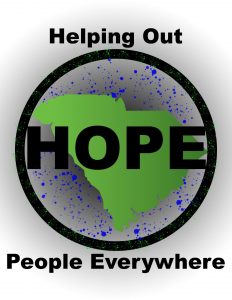
Hey there blog! Last week, we worked on a logo for the new branch off company of Wake Up Carolina. Their new name is H.O.P.E. but they were not sure what the acronym was going to stand for. So for my logo, I traced out the shape of South Carolina since that is the location of this company’s audience. I also used a blue splatter brush around the tracing of South Carolina. Around the painting and tracing, I put a thick circle around it and a dark gray gradient on the background layer. I am fairly happy with how it turned out. I feel like all of the colors went together because they were darker and neutral. For H.O.P.E. I used the acronym Helping Out People Everywhere because I feel like it explains that this new company is really trying to help people who are struggling with drug addiction in South Carolina. This week, we looked at Dreamweaver a little bit and watched some of the videos on the textbook website. I am really excited about learning on code on this new program. At North Myrtle Beach whenever I took at web design class, we had to just use Notebook on the Windows machines and we didn’t publish anything on the internet. So using Dreamweaver and actually publishing our websites on the internet for other people to see our work will be really interesting. The ACT was probably the longest standardized tests I have ever taken. I’m pretty sure we were not released for lunch until about 1:30. So in other words, it was a long day. However, I feel like I did pretty well on the actual test. My main concern is that did get to look at all of the questions. On most of the sections, I only got about ¾ of the way through and then I just answered A on the rest of them. If I have to take it again, I will definitely have to learn how to use my time on each section more wisely. When it comes to colleges, I have four options in mind. My first choice would be UNCW because I have a lot of people I know in Wilmington. My other options are College of Charleston, SCAD (for obvious reasons), and Coastal Carolina. It honestly depends on where I am at in life whenever I apply to these places as to where I will go.
February 23, 2018
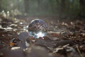
This week has involved almost nothing but learning how to code in Code Academy. I am really happy with how well it went though. I have been going through it pretty quickly and understand it pretty well. Luckily today is the last assignment we have to complete and last day we have to work on Code Academy in class. Finally we are done. Coding is so tedious and specific that it can get very boring and overly frustrating sometimes so I am happy we are at least done with the learning portion.However, we will have to recall all of this information whenever we make our websites for our Senior Mastery. For Burroughs and Chapin I kind of have two options. I can either submit the same crystal ball photograph that I submitted into the Art Fields competition or I can create something completely new/take some better photography images. I am really happy with the crystal ball image but I also think I can create something more artistic since it is mostly art that gets accepted into Burroughs and Chapin. I guess we’ll see what happens whenever we get closer to the competition date. I am really excited about making my own logo. I have been trying to brainstorm ideas about things that represent me and how I can make it creative and artistic. My idea right now is just to make my initials into some sort of design. But I am going to take some more time to collect more ideas, hopefully some better ideas. And maybe next year I will be able to improve on my logo even more since I will have more experience in the Adobe programs. I am also excited to make our website. It will be interesting to put our artwork on their so that other people/businesses can see our art. Hopefully this can help us learn to how run a website for ourselves in the future whenever we have a career in this field and more artwork to publish. Especially photographers can use their websites to post images from their photo shoots to show their skills and best work.
February 9, 2018
Hey there blog! Watching all of the Kinetic Type projects on Monday and Tuesday was awesome. I think that everyone did a really good job on their song and really made their video artistic and original. I really think once everyone finishes their whole song, we should watch them again to see the finished products and then post them on our website when we get to that unit in the class. My favorite typography project was Jake’s with his video on Can’t Feel My Face by The Weeknd. His choice of adding color to important words whenever the rest of the video was black and white was really smart. I am really happy that I know what I am putting in Art Fields and Burroughs and Chapin. For Art Fields I have two choices that Ms. Franklin really liked. One picture is of a cave in Mountain Rest, SC when I went there during Winter Break. I am really proud of this picture and how much better it looks now that I edited it in Photoshop. My other choice is of a crystal ball laying on the ground on forest trail Juliana and I went to in the Myrtle Beach State Park. I think that the crystal ball is definitely better so I think I am going to put the crystal ball picture in Art Fields and Burroughs and Chapin. I still need to write my artist statement for whichever piece I put in the show but I don’t think it should be too hard to write something deep and meaningful about either the cave or crystal ball. I have done CodeAcademy in my other web development classes so I have somewhat of a base for HTML coding. But I know that is a good way to learn the basics of coding and helps a lot. However, it is not always the most fun program to work on because it is very repetitive and tedious. Unfortunately it hasn’t work all week. I am not doing anything for Valentines Day because I’m a loner. I’ll probably just buy some Valentine’s candy from Walmart for myself and watch Netflix. So yeah…

February 2, 2018
Welcome back! This week we have all been busy with our Kinetic Type Projects. I think this has honestly been my favorite project of the year. I used the song Stressed Out by Twenty One Pilots for my project. It honestly describes me a lot because here recently I have had more and more responsibilities in life and I get very overwhelmed sometimes. Even though After Effects is the most tedious program we have worked with, it has been really fun working on this project. I am very proud of my final product and thing that it is some of my best work all year. It may not be the best in the class by any means, but it is probably one of the best things I’ve created. These past couple of weeks I have had my creativity flowing and I think it contributed to my confidence in this animation project. For the Technology Fair, Juliana and I are entering the photo manipulation category together. We are going to take picture at the Myrtle Beach State Park. We are going to use smoke bombs in the woods for an added effect. I am still searching for ideas for the Art Fields and Burroughs and Chapin competitions. However, I am going to really try and do another photoshoot next weekend because of how close the deadline is now. This second semester is going to be a lot more work than last semester. US History with Decerbo is not necessarily difficult it is just a lot of work. Powerpoint questions, vocabulary, tests, etc are all done almost within a week. Spanish 2 with Rosina :/ is a lot of busy work, which stinks. We have some sort of homework almost every night that nobody wants. Chemistry has probably been the easiest class of the three. It involves a lot of math, which is one of my best subjects. DC has been my saving grace at school. It is my escape from all of the stress of my academic classes. It will forever be my favorite class in school. 🙂 But so far, I have been doing well in all of my classes and have As in all of them.
January 26, 2018
It’s been awhile there blog. Well, 2017 has officially come and gone. The first semester of junior year has been amazing. AAST has been a great experience so far. My first semester classes ended in all A’s 🙂 I’m very glad that they are over though. PreCal and English 4 were a lot of work and I’m happy I was able to make the grades I did. I wish I would have studied more for my PreCal exam though. I was not as prepared as I thought and ended up getting a mid-B, which I know is not terrible but I know I could have done better if I would have studied. My English final however, ended up going really great. DC has been a great experience as well. I think one of my biggest accomplishments so far was getting my entry into the SC State Fair. However, I have learned so much about art, creativity, and design. So far, we have also done hot sauce labels and candy bar wrappers. Learning to do each part of the design and how to make them has been great. My final exam for DC, our candy bar wrapper, turned out really great in my opinion. I know Ms. D gave us all a 100, I still think that my wrapper would have really earned a 100. Our current project is an animation project in After Effects. We have to make a kinetic type project, in other words we are making a lyrics video for a song. I chose the song “Stressed Out” by Twenty One Pilots. I chose this song because I knew I could add a lot of effects to go with the words. There are a lot of text effects I have used on the important words that need emphasis. The names of some of the effects are chaotic, hummingbird, blur in, etc. Later on in my video, I am going to add an effect to an arrow as if it is part of a clock whenever the song starts talking about time. So far, I have done about 30 seconds of my video. I promise I am going to work on it this weekend haha. Alright…later.
December 15, 2017
Another week of Photoshop and our candy bar wrapper. In Photoshop, we finished the event flyer for the rock band. Continuing from last week, the first thing we did was add an outer glow to “Gasoline Heart.” Then, to add more of an effect, we took the fill off of the letters so that the outer glow shaped the outside of the letters. Next, we “noodled” around with different filters, like adding a blur, noise, etc. On my poster, I added a tiles effect that I really liked. Then, we learned how to add a bleed color for the clients view whenever the flyer is shown to the client. And yeah…that’s pretty much it. I have recently found a graphic design blog that is really good for inspiration and helping me get creative. It is called Creative Bloq. My favorite post I’ve seen was an infographic on how to get past a mental block and getting your creativity back. Earlier this week I was having a really bad creativity block and so it was nice to read that infographic and hear their perspective on it. I also recently found a really good photographer whose name is Chase Jarvis. He does a lot of naturistic and outdoors photography. His photos are not the normal posed pictures you see most of the time. He action shots where his model is taking moving and doing something. I am actually really glad that these were the topic for this weeks blog because it kind of forced me to do some research and get some more inspiration for some things I would want to create. The candy bar wrappers are still a work in progress… My first rough draft is pretty much finished. I came up with the idea for “The Break Up” whenever I heard about the former DC student who did the divorce bar. The main part of my design is a broken heart. Then I have a hand with a watch for the guy and a hand with a bracelet and ring for a girl. The hands are taking the two different parts of the broken heart. My next rough draft is going to be for my mom for her graduation gift. So yeah…I’ll talk to ya next year after Christmas break!
December 8, 2017
Eleventh blog of the year…This week we started dialing down more on Photoshop and learning more of the basics that are in the texbook. At the beginning of the week, we continued working on the picture of the ballerina (aka Curtis’ grandma). We learned how to change the picture from black and white to colored. To do this, we had to add a transparent layer over the black and white picture layer. Then we used the brush tool to paint color onto the picture. Once we finished painting over whatever part we chose, we had to change the blending mode to one that showed the picture behind it and the color added onto picture. Then we did this for every part of the picture, like the skin, dress, hair, etc. We also have started to work on a flyer for a band. The only thing we have done on it is placed it into photoshop, moved it to the left of the canvas, added a color fill layer of black, and added a gradient to make the black and the picture blend better together. So far, Photoshop has been pretty easy and laid back but I’m sure there will be something that will be super difficult once we get more into the book. On Wednesday while Ms. D was gone, I worked on editing pictures I took this past weekend. I did a photoshoot with a family at the beach. So I loaded them to Photoshop and just started editing. Then yesterday I tried to open them and none of the photos I had edited on Wednesday would open because it was not a regular jpg file. So I had to start over again. The image below is one of my favorite pictures from the photoshoot. I love how everyone is standing or sitting and everyone is smiling and looking at the camera. And I also love any picture under piers…I don’t know why, I just do. For our final exam, I chose to remake a Reese’s candy bar. Since my mom is graduating with her psychology degree from CCU this month, I decided it would be a cool graduation gift to make my candy bar for her as a congratulations. I told her about it last week and she loved the idea…plus she gets Reese’s which is one of her favorite types of candy. My only free time this week was spent on editing the photos from the family beach photoshoot so I haven’t done any tutorials this week which I’m really upset about because I want to learn a lot more about the programs. But there’s still a couple more weeks of double block this semester so hopefully I’ll have some time to do more tutorials.
